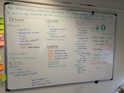
Early on in the project, we had realized that a lot of the information we wanted to convey throughout the tour could be easily tied to buildings, making their placement intuitive and simple. But there was some information, mainly contextual and having to do with wider history, that didn’t really fit anywhere along the route. This gave rise to the idea of a timeline, where the sort of synopsis of Trinity’s 400+ years of history could live.
In June, we wrestled with how this timeline would fit within the larger app. Would the user walk into it in Front Square? Would it live over the portals? Would it be its own sphere separate from the tour itself? Ultimately, we decided we wanted something inclusive, brief, and easy to interact with, so we chose to make a video.
That work fell to me. In writing the rest of the script for the POIs, I also wrote a script for the intro video. The script kept with the timeline theme, basically walking the viewer through the highlights of Trinity and Irish history. After making sure to have Enda and Adrian check the script for “Americanisms,” I downloaded After Effects and planned on taking full advantage of the 7-day trial. With everything else going on in the app, it was 3 days in before I actually got started. That didn’t leave much time, so I based most of my work off a timeline template thinking this would be more efficient. Looking back now, I realize I barely used any of it (of course).
Before starting this part of the project, I had forgotten how annoying the rendering time is with After Effects. I wasn’t able to make any precomps because I was still waiting on the final narration (and therefore the final timing), so the RAM playback was painfully slow. The timeline used a combination of historical images, nested videos, animated infographics, and Blender renders.
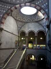
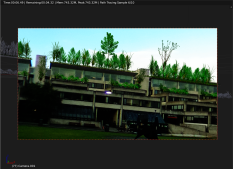
The latter proved to be the biggest headache of all. I wanted to illustrate how Front Square used to look surrounded by red-brick buildings, so I used a model of the Rubrics building I’d made in SketchUp. Unfortunately, exports from SketchUp do not play well with Blender, and each of the models had well over 10,000 objects in them. This obviously slowed down my computer a lot, and placing each of them was very trying. But it worked out, eventually. I used Adrian’s
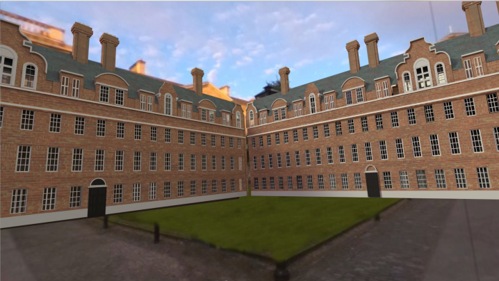
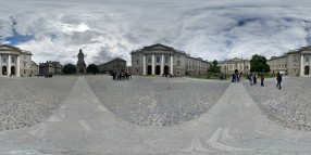
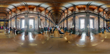
360 photo of Front Square as the environment background and placed them within the world convincingly enough, having a centrally-located camera spin around as four of the models rose from the ground in a quadrangle.
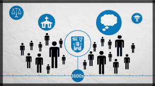
I also animated a lot of graphics in the video. I keyframed each of them by hand to coincide with the narration to illustrate things like the divide between Catholics and Protestants, Britain’s imperial standing, and the kinds of educational offerings the school provided at first. All of this information could have been conveyed simply using narration, but I think the addition of engaging, animated visuals is more apt to keep the viewer entertained and paying attention.

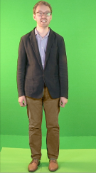
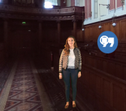
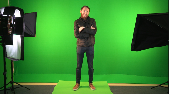 Enda and I ran the shoot last Wednesday, and managed to have everyone come in for 30-minute slots. Some took longer than others, and some were definitely more comfortable in front of the camera than others, but we got some good stuff in the end. I wanted the testimonials to come out naturally, so we started each interview with more of a conversation to get a rough idea of what each person wanted to talk about, and then ironed out a script naturally from what they said. It meant going over each story a few times, but it worked out.
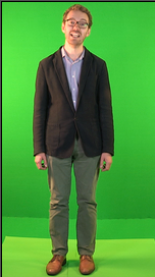
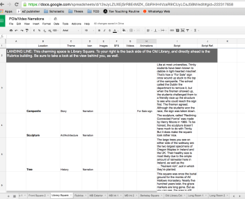 based on Enda’s scratch recordings of them and feedback we received during the midterm presentation. I organized these into a spreadsheet that included the location of each POI and the kinds of multimedia (image, video, animation) that will accompany each.
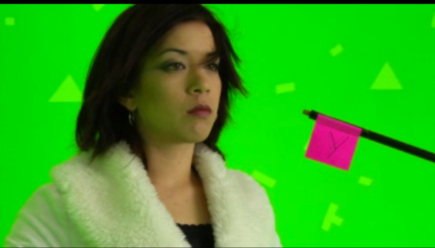 Enda had seen that the Easy Movie Textures plugin had a Chromakey shader, and I have worked with green screens in the past. After a few tests with green screen footage ripped from YouTube, he was able to make the person look like they were really in the scene. What’s even better, his dad’s work has a full green screen studio, equipped with a camera and lights. We’re going to test it out ourselves on Tuesday, with the hopes that we’ll get people in and recorded by the end of the week. I’m excited to get back into a studio and do some shooting!
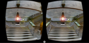
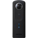 we’ll need for the project. The first, of course, is the 360° camera. Though we were originally looking at the LG 360, additional research showed that the Ricoh Theta S has a far better picture quality and is better suited to our needs. We also requested the Easy Movie Textures plugin for Unity that allows 360° videos to be played on Andriod and iOS, as this is not yet a native capability (we’re really on the cutting edge here!). Finally, we requested a stabilizer rig for shooting the 360° video, though the technology is so new that there are few rigs on the market for it. Many are made for GoPros or smartphones, but are not made for a 360° scope, and therefore the hardware is often very apparent in test footage. The LUUV stabilizer rig bills itself as “the first 360° video stabilizer,” but as a Kickstarter project it’s not yet in production. Though it lists a July 4 ship date, we have concerns that it will meet the timeframe we need for this project. We’ll have to test the camera when it comes in and see what kind of stabilization is necessary for the video and decide from there.